

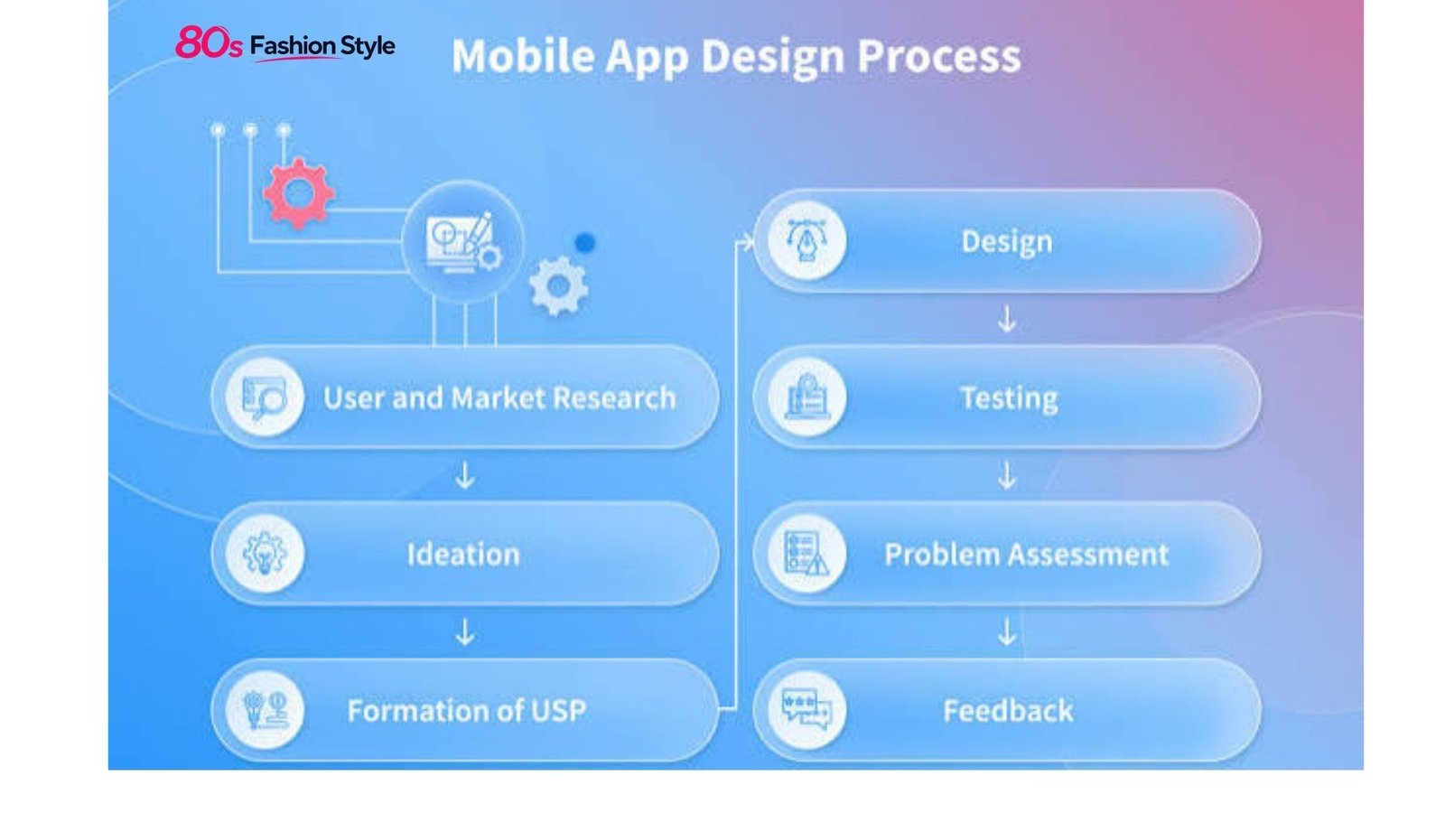
Learning how to design mobile apps starts with understanding the user’s task, not choosing colors or drawing attractive screens. A successful app should make its core actions easy to discover, understand, and complete on a small touchscreen. That requires thoughtful UX research, information architecture, interaction design, visual hierarchy, accessibility, and testing.
For beginners, the process can seem complicated. In practice, how to design mobile apps becomes much clearer when the work is divided into logical stages, from defining the problem to testing a clickable prototype.
Start With the User and the Problem
Before opening Figma or another design tool, define what the app is supposed to accomplish.
Ask three basic questions:
- Who will use the app?
- What problem are they trying to solve?
- What is the most important action they need to complete?
For example, a grocery delivery app may need users to search for products, add items to a cart, select a delivery time, and pay. Those tasks should influence the navigation and screen hierarchy.
User research can include interviews, surveys, competitor reviews, support-ticket analysis, and usability observation. You do not need a large research project for every concept, but you should have evidence for important design decisions.
Create a simple user flow showing the path from entry point to completed task. This helps identify unnecessary screens and confusing decisions before they become expensive to fix.
Plan the App Structure Before the Interface
A common mistake in mobile UX design is designing individual screens without considering how they connect.
Start with information architecture. Group related content and decide which functions belong in primary navigation, secondary navigation, or contextual menus.
For a typical consumer app, you might map:
- Onboarding
- Home
- Search or discovery
- Detail page
- Primary action
- Confirmation or completion
- Account and settings
The exact structure depends on the product. Avoid copying another app’s navigation simply because it looks familiar.
Platform conventions also matter. Apple’s Human Interface Guidelines emphasize hierarchy, consistency, and platform-appropriate patterns, while Android provides Material Design components and established navigation patterns.
| Design Stage | Main Goal | Useful Output |
|---|---|---|
| Research | Understand users and problems | User insights |
| User flow | Map important tasks | Flow diagram |
| Wireframing | Organize content | Low-fidelity screens |
| Visual design | Establish UI language | High-fidelity mockups |
| Prototyping | Simulate interactions | Clickable prototype |
| Testing | Find usability problems | Findings and revisions |
| Handoff | Prepare development | Design specifications |
Create Wireframes Before Adding Visual Polish
Wireframes allow you to solve layout and usability problems without becoming distracted by branding.
At this stage, focus on:
- Content hierarchy
- Navigation
- Button placement
- Forms and inputs
- Screen relationships
- Error and empty states
- Primary and secondary actions
A good wireframe should make the user’s next step reasonably obvious.
For example, if a banking app’s main purpose is transferring money, the transfer action should not be buried beneath decorative content. The interface should give the primary task appropriate visual priority.
Design for Different Screens
Mobile interfaces must work across different screen sizes and orientations. Android specifically recommends adaptive layouts that support phones, tablets, foldables, and other form factors.
Do not design only for the phone model sitting on your desk. Test layouts at multiple dimensions and consider longer text, larger system fonts, localization, and different device settings.
Build a Clear Visual System
Once the structure works, develop the visual language.
Choose a limited color palette, readable typography, consistent spacing, and a purposeful icon style. Establish reusable components for buttons, inputs, cards, navigation elements, dialogs, and other recurring interface patterns.
A design system makes this easier because decisions can be reused instead of recreated on every screen. Android’s Material Design, for example, provides reusable components and patterns intended to support consistent interface construction.
For iOS, Apple’s guidance similarly encourages designers to use system-defined components and patterns to create familiar experiences.
💡 Pro Tip: Design your most important user flow in grayscale before finalizing colors. If users cannot distinguish the primary action without color, the hierarchy may need stronger spacing, typography, size, or positioning.
Make Interaction Design Predictable
Knowing how to design mobile apps effectively means thinking beyond static screens. Users interact through taps, swipes, scrolling, gestures, keyboards, voice input, and system controls.
Every interaction should produce understandable feedback. A button might change state after being pressed; a form should explain validation errors; a loading state should communicate that the request is processing.
Avoid unnecessary animation. Motion should help users understand relationships, transitions, or changes in state rather than simply decorate the interface.
Forms deserve particular attention. Keep them short, use appropriate input types, preserve entered information when errors occur, and clearly explain what needs correction.
Treat Accessibility as Part of Design
Accessibility should not be a final checklist item. It belongs in the design process from the beginning.
Consider readable text, sufficient contrast, meaningful labels, logical focus order, touch interactions, captions where relevant, and support for device accessibility settings. W3C guidance specifically addresses accessibility for mobile websites and applications, including challenges involving touchscreens, small displays, different input methods, and changing environments.
Do not communicate essential information through color alone. A red field, for example, should also have a clear error message or other recognizable indicator.
Prototype, Test, and Revise
A polished mockup can still hide serious usability problems. Prototyping exposes those problems before development.
Create a clickable prototype for the most important journeys, then ask representative users to perform realistic tasks. Watch where they hesitate, tap incorrectly, misunderstand labels, or abandon a process.
Do not tell participants what button to press. Give them a goal and observe their behavior.
Test critical scenarios such as:
- First-time onboarding
- Account creation
- Searching
- Completing the primary transaction
- Recovering from an error
- Changing an important setting
Record problems by severity and revise the design based on evidence rather than personal preference.
Avoid Common Mobile Design Mistakes
Several problems repeatedly weaken otherwise attractive applications.
Too much information: A small screen cannot comfortably display everything at once. Prioritize.
Hidden primary actions: Users should not have to hunt for the task the product is built around.
Inconsistent controls: A component that behaves differently on different screens creates uncertainty.
Weak error handling: Telling someone that “something went wrong” does not explain what happened or what to do next.
Desktop-first thinking: Shrinking a desktop interface does not automatically produce a good mobile experience.
Ignoring platform conventions: iOS and Android users have established expectations. Your brand can be distinctive without making familiar interactions confusing.
📌 Key Takeaway
The strongest approach to how to design mobile apps is to solve the user’s problem before polishing the interface. Start with research and flows, create focused wireframes, establish a consistent design system, support accessibility, and test realistic tasks before development. Visual appeal matters, but usability determines whether the interface actually works.
Frequently Asked Questions
What software is best for mobile app design?
Figma is widely used for interface design and prototyping, but the best tool depends on your workflow, team, and platform. The essential capabilities are creating reusable components, responsive layouts, interactive prototypes, and developer-friendly specifications. The tool matters less than having a disciplined design process.
How long does it take to design a mobile app?
The timeline depends on the app’s complexity, number of screens, research requirements, design system, and testing cycles. A simple app may require a relatively short design phase, while a large product with complex workflows can require substantially more research, prototyping, iteration, and documentation.
Should I design for iOS or Android first?
Choose the platform based on your audience, business requirements, and development strategy. If you need both, establish shared product principles while respecting each platform’s conventions. Apple’s Human Interface Guidelines and Android’s design guidance provide useful platform-specific references.
What makes a mobile app easy to use?
An easy-to-use app has clear navigation, understandable labels, visible actions, consistent interactions, helpful feedback, accessible content, and a focused information hierarchy. Users should be able to predict what will happen when they interact with an element and recover easily when something goes wrong.
How do I test a mobile app design?
Start with a clickable prototype and give users realistic tasks without explaining the interface. Observe their behavior, record confusion and errors, then prioritize improvements. Repeat testing after significant changes. Testing real task flows is more informative than asking users whether they simply “like” the design.
Conclusion
Good mobile design is less about filling screens with impressive visuals and more about removing friction from important tasks. If you are learning how to design mobile apps, begin with the problem, build the simplest useful flow, and validate it with real users before investing heavily in visual polish.
A strong interface feels clear because its hierarchy, interactions, content, and platform conventions work together. That is the foundation for an app people can understand quickly and use with confidence.
Image SEO Suggestions
Featured Image Idea: A modern smartphone displaying a clean mobile app interface beside wireframes, user-flow diagrams, and a design-system palette on a designer’s workspace.
SEO Filename: how-to-design-mobile-apps.jpg
Alt Text: How to design mobile apps with UX wireframes and a modern smartphone interface
Caption: A practical mobile app design workflow from wireframes and user flows to a polished interface.
Internal Linking Suggestions
- Anchor Text: mobile app development process
Suggested Placement: Link from the introduction when explaining the transition from design to development. - Anchor Text: UX design best practices
Suggested Placement: Link within the section discussing user research, information architecture, and usability. - Anchor Text: app development cost
Suggested Placement: Add the link after discussing why early prototyping and testing can identify problems before development.
Recommended Schema
Article — Best fit for the primary content. If the page uses the FAQ section as structured FAQ content and meets Google’s applicable requirements, FAQPage may also be considered separately based on the site’s implementation and eligibility.
